Watching the Run
A run shows itself two ways at once, and they answer different questions. The canvas shows what is happening now. The strip charts show the whole mission as one picture, so they are where you find out where the interesting part is. Use the charts to choose a moment; use the canvas and the Step Info column to look at it.
Where it is
The Execution page at /execution, in the two middle columns: the 3D canvas with the Session
Messages panel beneath it, and the Strip Charts column beside it. Both columns are switched on
and off from the quick-toggles on the menu bar, and every panel inside them folds to its own header.
The canvas
What the canvas draws is a choice, not a fixed set. It opens showing the workpiece, the fixture, the dimension bar and the tool path. The machine and the tool are not drawn until you ask for them — which is usually what you want, because a five-axis machine at home position fills the frame and hides the cut you came to watch.
The panel header carries the generic camera control — a View menu of seven presets: Isometric, Front, Back, Right, Left, Top and Bottom — and beside it the four that belong to a run:
| Control | What it does |
|---|---|
| Tool Path | Shows or hides the tool path through the whole program |
| Path Points | Adds the per-position dot markers along it. Editable only while Tool Path is on |
| Scene ▾ | Which elements are drawn, in three groups |
| Meshed Geom ▾ | The workpiece's rendering-cache budget, and the ideal-versus-actual difference display |
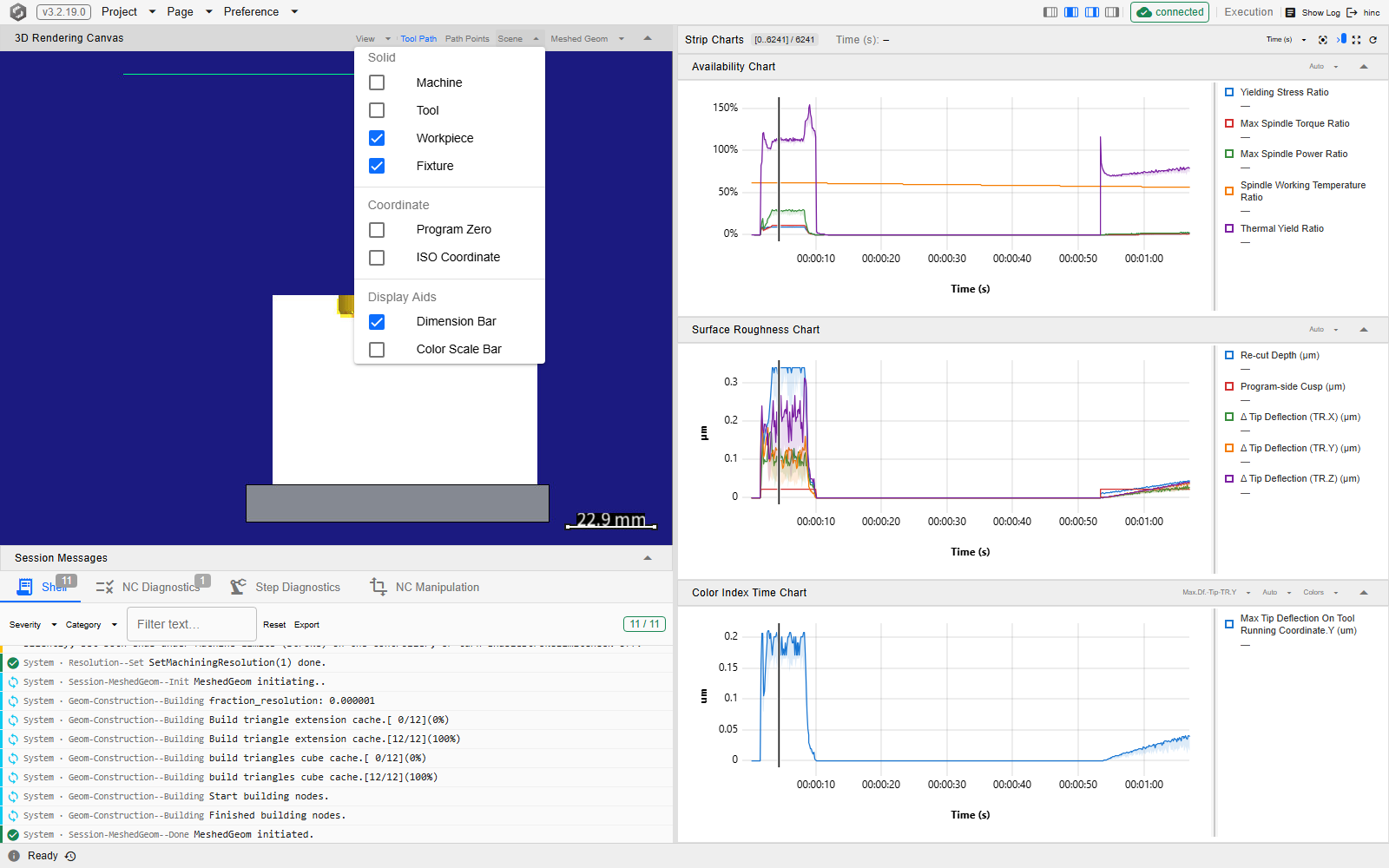
The Scene menu groups its checkboxes the way the renderer groups them: Solid — Machine, Tool, Workpiece, Fixture; Coordinate — Program Zero, ISO Coordinate, and Heidenhain Coordinate on a Heidenhain project only; Display Aids — Dimension Bar, Color Scale Bar. The tool path is deliberately not in this menu: its own button owns it, and Path Points hangs off that.
Under Meshed Geom sit two rows, each opening a panel of its own: Graphic Cache, the memory budget for the workpiece's rendering cache, and Diff Visual Radius, which displays the difference between the ideal geometry and the actual one. The second carries a badge reading None or Diff, so the menu answers “did this run leave a difference?” without your opening the row.
Collapsing the canvas does not disconnect it. The panel keeps it mounted and simply stops it drawing, so re-expanding is instant rather than a fresh connection.
The Scene menu open over the canvas at /execution, with the Strip Charts column beside it. The
three groups are the ones listed above, and the ticked boxes are the set the page opens with —
Workpiece, Fixture and Dimension Bar — with Machine and Tool unticked.
The three strip charts
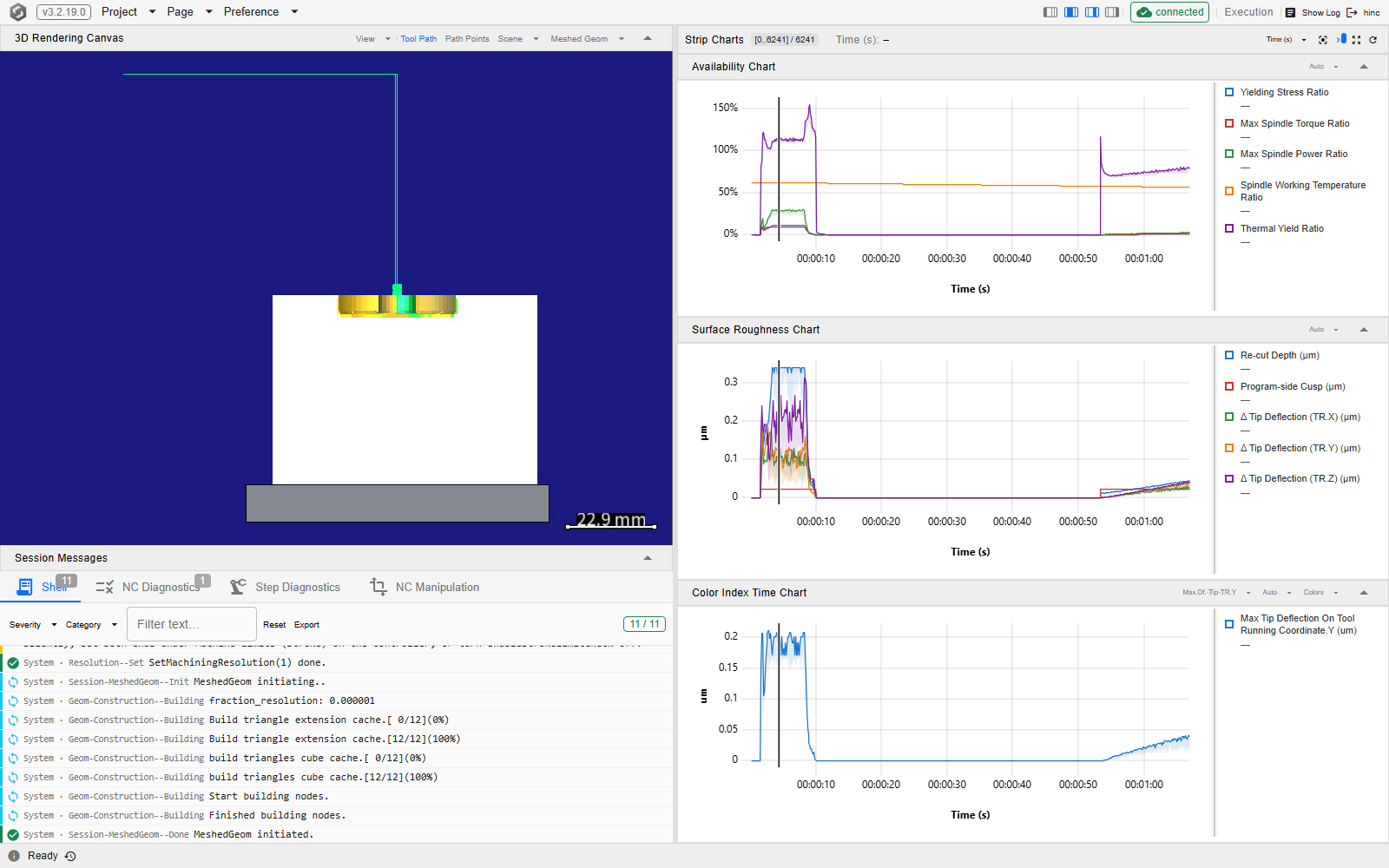
One group bar drives three charts, and each of them plots the whole mission rather than the current moment:
| Chart | What it plots |
|---|---|
| Availability Chart | Five ratios: yielding stress, max spindle torque, max spindle power, spindle working temperature, thermal yield |
| Surface Roughness Chart | Re-cut depth, program-side cusp, and tip deflection in X / Y / Z, in µm |
| Color Index Time Chart | One property you pick, from every step property the run can quantify |
Each series is drawn as a band between its minimum and its maximum, not as a line through samples: the window is downsampled to the width it has on screen, so what you are reading is the shape of the run — where the spindle is loaded, where surface quality degrades, where thermal limits are approached — rather than individual values. The values themselves are in the legend panel down the side of each chart, which follows the cursor and can be dragged wider.
All three carry a Y-axis range editor in their header — Fit to the data, Lock to a minimum and maximum you type, or Symmetric about zero with a bound; locking one is how you compare two parts of a run without the axis moving under you. The Color Index chart adds two more: the property picker, which is a type-to-filter list of every quantifiable step property, and Colors, which edits the colour guide. Colors is worth understanding before you touch it: it drives the colour of the workpiece in the 3D scene and the colour scale bar, not the line in the chart.
The group bar
| Control | What it does |
|---|---|
| Range chip | The slice of the mission currently shown, against its total step count |
| Cursor readout | The x-value under the pointer, shared by all three charts |
| X-axis mode | Time (s) or Step index, applied to all three at once |
| Fit view | Fits the 3D canvas to the tool path — the one control here that acts on the canvas |
| Stick to live end | Keeps the window's right edge pinned to the running end of the mission |
| Reset display range | Back to the whole mission, and re-arms stick-to-end |
| Reload | Re-fetches all three charts |
Stick-to-end turns itself off the moment you pan or zoom, because both of those set a definite right edge. That is the behaviour you want while a run is going — you can look at something without being dragged back to the live end — and Reset display range is how you re-arm it.
Reading a chart with the pointer
The three charts share one window and one selection, so a gesture on any of them moves all three.
| Gesture | What it does |
|---|---|
| Click | Selects that step — this is what fills the Step Info column |
| Drag left or right | Sweeps a range and zooms to it on release |
| Right-drag or middle-drag | Pans |
| Wheel | Zooms about the pointer |
| Hover | Puts that x-value in the group bar's cursor readout |
| One finger / two fingers | Pans / pinch-zooms, on a touch screen |
A left drag shorter than a few pixels counts as a click, so selecting a step does not need a steady hand.
Before anything has run, all three read No mission data. A chart that has data but no physics behind it reads No physics data instead — that is what the Availability chart looks like when the run produced no physics results.
The three charts with the demo mission paused part way through and a step selected. The vertical rule crossing all three at the same place is that selection; the range chip on the group bar names the window, the x-axis is in seconds, and each chart's legend stands down its right side with one entry per series — five on each of the first two, one on the Color Index chart, which plots the single property named in its header.
See Also
- Running a Simulation — the rest of running a job
- Starting and Stepping — the transport that makes these fill
- Inspecting a Step — the per-step detail a click on these charts opens
- The Application Window — the column quick-toggles that show and hide these two columns
- Strip Charts — the components behind this column: the shared window, the pointer contract and the data behind each series
- Execution Extended RenderingCanvas Tool Bar — the component behind the canvas header's run controls